
Redesigning pending page
Launched, June 2025
Timeline
April - June, 2025
My Role & Contribution
Product Designer, 100%
Team
Collaborated with a PM, engineers, and a Director of Design
What is Lenme?
Lenme is a Peer-to-Peer lending platform which connects borrowers and investors, generating $1.9M annual revenue, with 100K monthly active users and 3.0M+ total users.


Problem
Lower drop-off observed during pending stage (steps 4–6).
After borrowers request a loan, investors submit offers. The borrower sees the offer while the investor’s pending page shows ‘Waiting for Accept.’
User voice
Main user quotes from app store review & CS team
(CS팀으로부터 유저의 불만 발견)

“It takes way more time to see one sort of statuses!”
“Hard to find ‘Accepted’ with Sign Now button, frustrating!”
Data
25.7%
CTR
>45s
Page duration time
74.3%
Drop-off rate
Data showed the ‘Sign now’ CTR was below 25.7% (18/70) and the page duration time exceeded 45s, impacting high drop-off rate(52/70).
‘Sign now’ CTR이 25.7%로 클릭 수가 있었지만 , 71% 이상이 45초 초과로 머물러 의사결정 지연 신호가 확인. 해당 페이지의 이탈율 74.3%로 개선 필요.
CTA 버튼 클릭수(50%이하 - 개선 필요), 페이지 평균 체류 시간 측정(15-30초 - Good | 45초 이상 - 개선 필요)
페이지 내 체류 시간 높고 핵심 행동(CTA 클릭)이 감소하여 참여도가 낮아지는 추세
이탈율 = (No-click 세션 수, 70-18) / (화면 조회 수, 70)
70 명의 사용자가 페이지를 본 조회수는 최소 1회 - 화면 조회 수 = 최소 70회로 지정
Why investors get stuck
As the loan request progresses, users’ emotion graphs showed a sharp drop as investors experience frustration to review pending statuses.
저니맵을 통해, frustration 포인트 확인

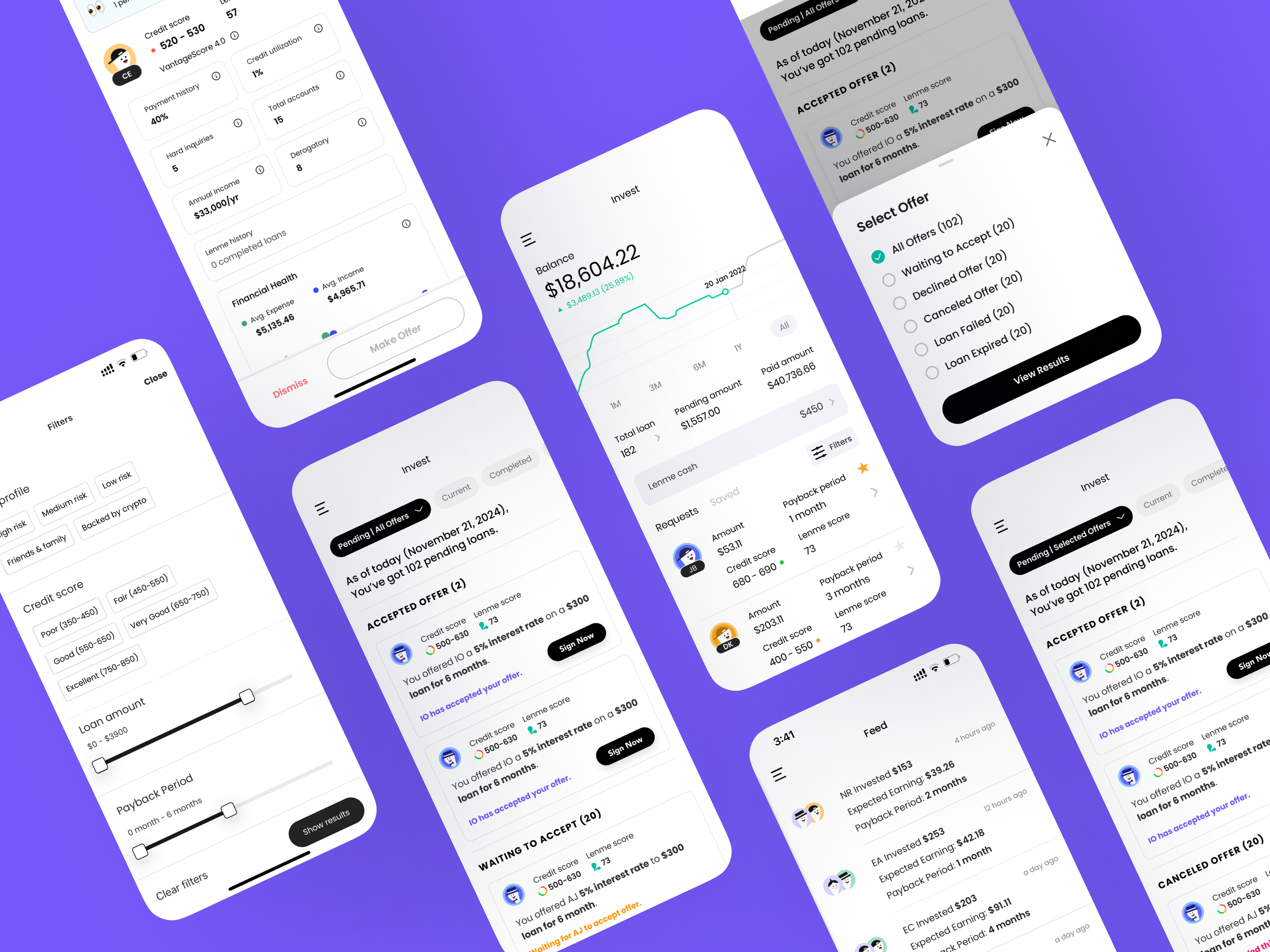
Old pending pages


No clear categorization and ‘Accepted’ card with CTA button (Accepted, Waiting, Expired, etc.), making it hard to track.
분류가 되어 있지 않아 빠르게 찾기 어렵다. + CTA 카드가 눈에 띄지 않아 유저의 행동 유도 어렵다.
Scattered info generates overload, enabling users to spend more time reviewing loans.
Problem statement
Poor structure + weak CTA visibility = slower decisions and lower “Sign now” conversion.
분류되지 않은 정보와 시인성 낮은 CTA로 사용자가 필요한 내용을 빠르게 판단하지 못해 체류시간만 늘고 ‘Sign now’ 전환이 낮다.
Hypothesis
HMW make key loan info on pending page well scannable and the “Sign now” CTA unmistakable to accelerate decisions for investors?
어떻게 하면 핵심 대출 정보를 파악 가능하게 하고 ‘Sign now’ CTA를 명확히 보여줘 행동유도를 더 빠르게 만들 수 있을까?
Rapid ideation
To reduce investor frustration, I proposed categorizing loan statuses, simplifying the UI with collapsible menus and visual&contents hierarchies.


Iteration
Iteration 1
Iteration 2


Iteration 1
At-a-Glance Info with accordion interaction, but it’s challenging to navigate if there are a lot of cards on horizontal layout.
Iteration 2
A/b testingng with 70 users showed → 70% users chose the right one.
Multiple cards visible at once(not a carousel, not a collapsed row) → faster scan.
Filter via ‘Select an Offer’ for quick browsing.
Final design


It has been launched successfully in June 2025

After
Before
Impact
Achieved a significant increase in our success metrics: Main card CTR and page duration time, reducing drop-off rate.
CTR, 35/70 users
50.0%
Page duration time
50.0%
Drop-off rate (relative -32.7%)
>13s
Takeaways
Quickly analyzing user feedback is crucial when implementation speed leaves little time for user meetings.
Iterating rapidly with multiple options helps address user and business needs effectively in a very fast-paced environment.


